Monday 2 May 2011

Final Designs


For my final designs i decided to have a messy colour feel to it. I didnt want the colours to be in a specific place, but all over the drawings so it has a more exciting feel to it. I think BRIT is a very carefree exciting school with a lot of things going on, i really wanted to present that with the colours and orginisation of it all. I used colours for each sign that relates to where it is leading to, for example i used green for the cantine as it would give a more food friendly feel to it. In the foyer i used a mix of colours as it is the centre of all the departments within the building.

I tried drawing objects and illustrations that related to the sign. I looked at Verhoevens work and how she drew her designs for inspiration. I didnt want things to look too neat, so i decided to go with using a ink quill to draw. I used a sharpie pen for the arrows to make it look more clear, as although i want it to look messy i think having something that looks too messy defeats the point of having signs around the building if the people can read them.

What i found difficult was thinking of designs that would appeal to most people, i didnt want some things to look stereotypical like using a paint brush and pencil to represent VAD, so i decided to be more creative and find something else that doesnt have to represent the department but can show some kinda familiar relation to it.

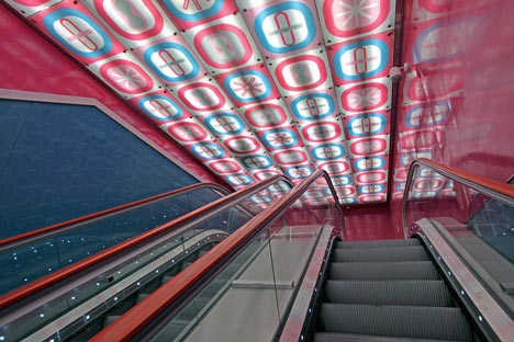
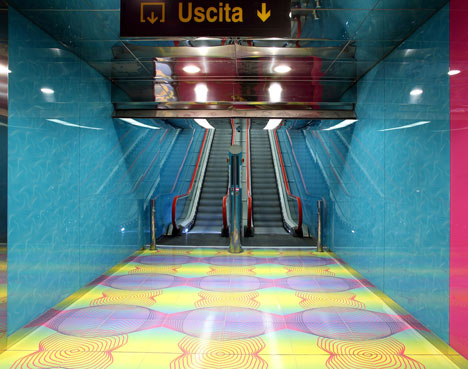
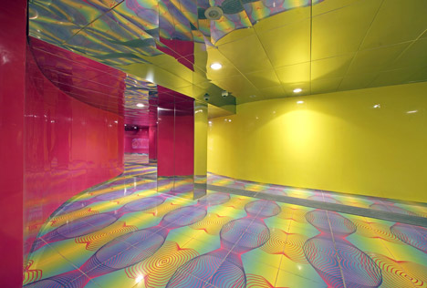
Looking up different illustrators and ways of doing wayfinding really helped me in how creative i can be. at first i wasnt sure what my limits were but when looking at Great Ormands street hospital i felt that not everything should be taken seriously. 

I think the designs went well and came out how i wanted to, although i think more boldness of colour would help a lot with the designs

http://www.mydeadpony.com

I found an illustrator i really liked, i thought his way of drawing was really unique and had that kind of creative sketchy feel i was looking for in my signs.


i really love his use of colours and how they are splattered about much like Julie Verhoevens work. I thought his use of font and how he mixes it in with the main subject of his drawings was very creative, i think his work will greatly inspire me along with Verhoevens work.
As i wasnt sure how to design signs for other departments around the buildings, like what sort of content and concept drawings i could put towards it. i made a collage of photographs relating to the some of the departments for inspiration. this really helped as it gave me much more of a broader insight on what i can do and what i can include in the signs.

Departments within the new building

1st floor :
Foyer, cantine, technolodgy and textiles

2nd floor:
Art & Design, Mac Suit, Dark room and ICT suite

3rd floor:
Maths, SEN, ICT suite

Now that i know what rooms and deparments will be within the building, it will definately help with creating signs and wayfinding relating to each room

More concept art


I decided to more concept artwork but this time to experiment more with colours, and text. I thought it would be nicer to have colours placed where the lines are, but still giving a messy splattered look. I liked my first idea of having swirls as part of the wayfinding, but i think the text here looks more bold and vewiable. so people wont have to look twice when looking at the signs. I will be making signs for other rooms, as i have only been doing them for girls due to the fact it is a simple idea.

Sunday 17 April 2011


I believe these two trials look a lot betetr than before. instead of using a brush or sharpie, i use the lid on the ink pot to create this effect. it turned out a lot better than expected and i think the colours i used really compliment each other and you can also see how julie verhoeven has really inspired me. what i found was difficult was that the lid ran out of ink easily, so the ink marks look washed out in some places which is not what i wanted. i will have to find a way to make sure that i can cover up the places where the ink has washed out

sketch trials

i decided to do some more trials using different materials

i used a paint brush and ink on the blue one, it hought it turned out okay but too detailed. i wanted a sketchy 10 minute looking job but still creative.
On the red one i used a black sharpie, i dont think it turned out as well as i hoped as you are quite limited when it comes to line drawings especially with a sharpie.
I am going to experiment more with different materials i can use with ink and see how it turns out.

The idea was to create a illustration to represent a department which will be in the building to put on the walls along side the arrows. so there would be a photography arrow with a drawing to accompy it. 

Before with the trials, i thought the writing seemed too 'informal' and messy. I decided to scan the backgrounds in and place a font on top from photoshop and use a tablet to draw on the swirls. I thought this look so much better and gave me a better idea on how i could develop it further
The idea is to have this printed on white walls so the arrows will direct in the direction its supposed to. I dont think it is hard to read and i find it very simple but different to an ordinary sign

wayfinding design trials 1


Julie Verhoeven, collection of work to for inspiration

Julie Verhoeven

Julie Verhoeven is an artist and designer based in London.
After studying fashion she began her career assisting John Galliano before working in the fashion industry as a designer, illustrator, creative director and tutor.

Verhoeven’s own fashion label, Gibo by Julie Verhoeven,
was launched in September 2002, and she went on to collaborate
with global brands including, Louis Vuitton, Versace, Mulberry
and H&M.


I found Verhoeven by looking through books of design, what really caught my eye was her invitations to a show 'Fat Bottomed Girls' and 'unforgiven' I thought her style of drawing and use of colour was really similar to how i wanted to design the interior and way finding of the building.

I really liked how she did the writing in this invitation here. I thought how the swirls joined together was really playful and carefree. I could establish this idea and make it into arrows for wayfinding. I believe this would work well with the branding of the building as it is for art, musical theatre etc.


Her invitation to 'Unforgiven' was really interesting. Although it was a different show it had the same feel to the art, as swirls and lines were used and join together to create characters within the invitation. The colours and how it was applied were very carefree and fun. I want the new building to be carefree and fun, i dont want people to go in feeling like they dont want to go to lesson. Having a building with a relaxed feel to it would create a positive atmosphere

 To get a better insight we were told to redesign the BRIT school logo so we got a better idea on how visual branding could work.


First i looked at the logo, the main colour schemes and how it worked. Orange and blue were the main colours used in the logos, although the Blue would change to green or turqouise in some photographs.


I then made a brainstorm on what could be suitable to create a motif. For example typography, colours and objects that could work well with the new building.


I foccused more on colours here. i decided that pastel natural colours should be used to have a relaxed feel about the building. as too many bright colours could cause headaches and general dislike throughout the public. I dont want to relate the design to something thats already familiar with people.


I thought of keeping the main design, but changing the background. Mixing in different colours, somewhat to represent the mixing of different subjects and people in the new building. I thought this looked really nice and worked well with the logo. I will take this further into my concept designs

BRIT school

BRIT School for Performing Arts & Technology is an independent school located in The Crescent, Selhurst, Croydon. The BRIT School is dedicated to education and vocational training for the performing arts, media, art and design and the technologies that make performance possible. Its principal is Nick Williams.

I personally see the school as something colourful, in personality and atmosphere. Although the school is mainly well known for the BRIT awards and the music talents that come from the school (Amy Winehouse, Adelle, Kate Nash) but the school has much more to offer.

Sunday 10 April 2011

observational drawing of the refurbished building

Aedas

The architectual firm Aedas will be designing and building the new building for the BRIT school. I looked into the firms website and look at their buildings to get a better idea of what to expect. The firm works with a lot of large buildings and uses glass quite often.
Out of their work i thought this was really amazing and good, due to its height and design. as it has a twist going around the building, it almost looks physically impossible to build something like it. i thought it was very creative and different from the typical block buildings.
Wayfinding is a method where you use signs and posters around a building to show where places are and in which direction/area they are in. With wayfinding you can be very creative then putting up ordinary signs with arrows. for example the wayfinding system in Great Ormand Street Hospital. As the hospital is specially for children, they made a twist on wayfinding but making i more child friendly. They used Animals and nature as their main theme of wayfinding, decorating the walls and adding a play of words on signs. I thought this was very creative and sweet, something i will put into consideration when planning for the project.

University of Naples Metro Station

I thought another interesting design was the University of Naples Metro Station. As soon as i saw pictures of it i knew it was difinately something different to it. The bright colours and vibrant patterns on the wall and floors instantly attract attention. I thought it was very out of the ordinary and strange as usualy stations are dull with grey tones and nothing else interesting. This gave me inspiration to think differently, that rooms and interior design in public places dont always have to be dull and boring, you can liven up things up with bright colours and patterns. I also think that colours in the spaces around you (whether its your work or home) instantly make an impact on your day, i think seeing bright colours like this would make people feel more energetic and happy as it wouldnt be boring.

Starbucks brand and logo development

 
Starbucks is a good example of logo development and change. for example the colours and writing have changed into what appears to be just a green logo with no writing. My first opp ion of the logo changes was the fact that it almost looks like it zooms into the woman every time it develops. also the fact that they remove the writing each time, this shows how famous the brand is that the text around it doesn't matter.
The colours used give the impression of Eco-friendly due to the green feel of the branding.