Sunday, 17 April 2011
Before with the trials, i thought the writing seemed too 'informal' and messy. I decided to scan the backgrounds in and place a font on top from photoshop and use a tablet to draw on the swirls. I thought this look so much better and gave me a better idea on how i could develop it further
The idea is to have this printed on white walls so the arrows will direct in the direction its supposed to. I dont think it is hard to read and i find it very simple but different to an ordinary sign
Julie Verhoeven
Julie Verhoeven is an artist and designer based in London.
After studying fashion she began her career assisting John Galliano before working in the fashion industry as a designer, illustrator, creative director and tutor.
After studying fashion she began her career assisting John Galliano before working in the fashion industry as a designer, illustrator, creative director and tutor.
Verhoeven’s own fashion label, Gibo by Julie Verhoeven,
was launched in September 2002, and she went on to collaborate
with global brands including, Louis Vuitton, Versace, Mulberry
and H&M.
I found Verhoeven by looking through books of design, what really caught my eye was her invitations to a show 'Fat Bottomed Girls' and 'unforgiven' I thought her style of drawing and use of colour was really similar to how i wanted to design the interior and way finding of the building.
I really liked how she did the writing in this invitation here. I thought how the swirls joined together was really playful and carefree. I could establish this idea and make it into arrows for wayfinding. I believe this would work well with the branding of the building as it is for art, musical theatre etc.
 Her invitation to 'Unforgiven' was really interesting. Although it was a different show it had the same feel to the art, as swirls and lines were used and join together to create characters within the invitation. The colours and how it was applied were very carefree and fun. I want the new building to be carefree and fun, i dont want people to go in feeling like they dont want to go to lesson. Having a building with a relaxed feel to it would create a positive atmosphere
To get a better insight we were told to redesign the BRIT school logo so we got a better idea on how visual branding could work.
First i looked at the logo, the main colour schemes and how it worked. Orange and blue were the main colours used in the logos, although the Blue would change to green or turqouise in some photographs.
I then made a brainstorm on what could be suitable to create a motif. For example typography, colours and objects that could work well with the new building.
I foccused more on colours here. i decided that pastel natural colours should be used to have a relaxed feel about the building. as too many bright colours could cause headaches and general dislike throughout the public. I dont want to relate the design to something thats already familiar with people.
I thought of keeping the main design, but changing the background. Mixing in different colours, somewhat to represent the mixing of different subjects and people in the new building. I thought this looked really nice and worked well with the logo. I will take this further into my concept designs
BRIT school
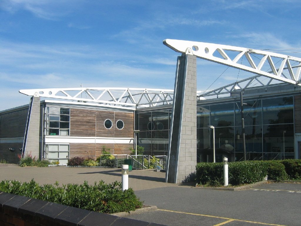
 BRIT School for Performing Arts & Technology is an independent school located in The Crescent, Selhurst, Croydon. The BRIT School is dedicated to education and vocational training for the performing arts, media, art and design and the technologies that make performance possible. Its principal is Nick Williams.
I personally see the school as something colourful, in personality and atmosphere. Although the school is mainly well known for the BRIT awards and the music talents that come from the school (Amy Winehouse, Adelle, Kate Nash) but the school has much more to offer.
Sunday, 10 April 2011
Subscribe to:
Posts (Atom)


